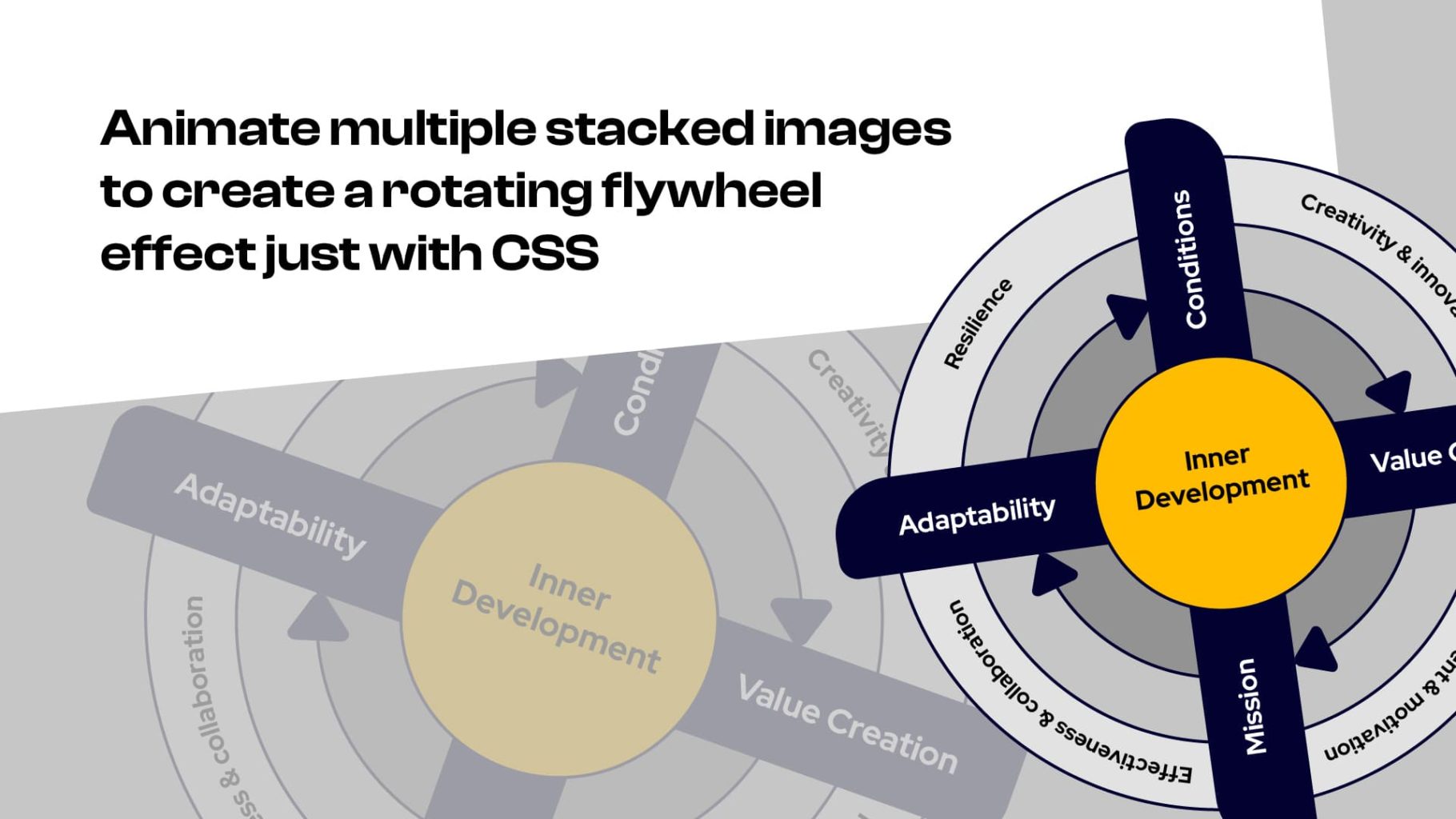
A client recently asked me to redesign one of their graphics. So, while I was doing that in Adobe Illustrator, I exported it as 4 layers, to animate it using a rotate effect on hover.
The result
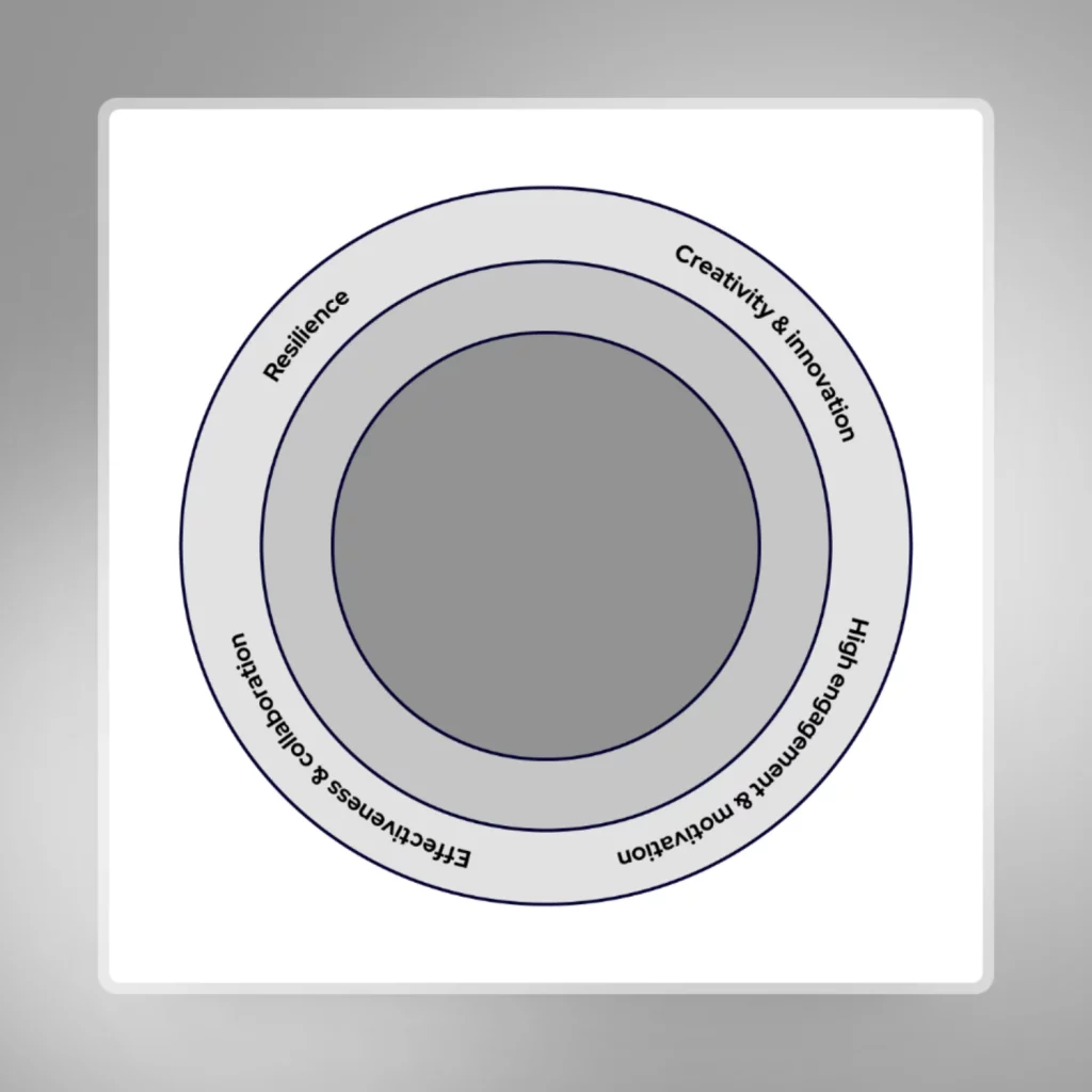
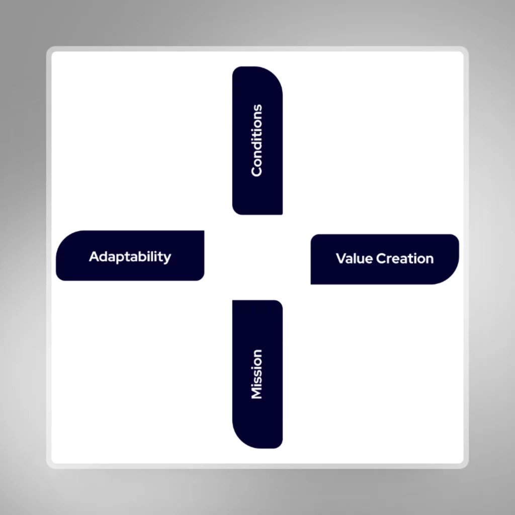
The key to this process is that you must have 4 equal size perfectly square images to work with with a transparent background (PNG or WEBP). You first build out each image layer with its respective elements and then export the seperate layers. For example, my graphic contained the following 4 images.
The images
This image is the base (bottom layer)
This is the second layer
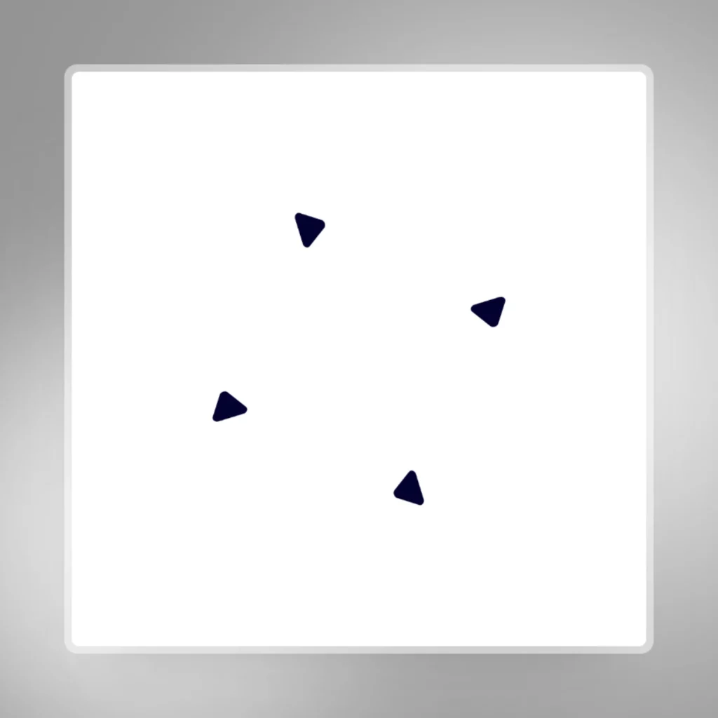
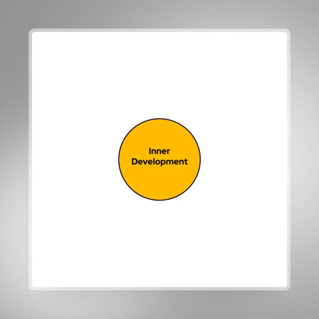
This is the third layer
This is the fourth layer
HTML structure required
- Insert all the images inside a DIV that has a position of ‘relative’ and assign it a class of something like ‘.flywheel-wrapper’.
- Images need to have a unique class such as ‘.image-1’ and ‘.image-2’ respectively, or you can just use the image IDs
- Ensure all images have a position of ‘absolute’ and that they are in the correct layered order – you may need to use z-index
- Assign a unique class to the images you want to rotate on hover – such as ‘.rotate-1’ and ‘.rotate-2’
Animate on hover
Apply the following CSS to the parent DIV that houses the images. This code will rotate only the classes ‘.rotate-1’ and ‘.rotate-2’, so if you need to rotate any of the other image layers, you’ll need to assign more ‘rotate-#’ classes and add its corresponding animate CSS to this code:
@keyframes rotateImage1 {
    from { transform: rotate(0deg); }
    to { transform: rotate(360deg); }
}

@keyframes rotateImage2 {
    from { transform: rotate(0deg); }
    to { transform: rotate(360deg); }
}

@keyframes rotateImage3 {
    from { transform: rotate(0deg); }
    to { transform: rotate(360deg); }
}

.parent-flywheel:hover .rotate-1 {
    animation: rotateImage1 2s ease forwards;
}

.parent-flywheel:hover .rotate-2 {
    animation: rotateImage2 2s ease forwards 0.5s;
}

.parent-flywheel {
transition: all 0.2s ease;
}